Team guide, Accessibility bugs
The BBC is for everyone. Having an accessibility bug in your product could mean that it’s not for everyone.
Accessibility bugs can disable. They can prevent products and their content being available to and accessible to as many people as possible.
It’s a requirement of all the digital products we produce to meet the BBC Mobile Accessibility Guidelines or equivalent WCAG guidelines outside the UK, so they are accessible to the widest possible audience.
In addition to meeting these guidelines, the level of user experience for users of assistive technology should be comparable where possible, to that of those who don’t use assistive technology.
If you don’t meet a guideline or have a poor user experience when using assistive technology, you have an accessibility bug in your product.
What bugs mean for users
Accessibility bugs don't just apply to users with disabilities. Accessibility bugs mean that our content is not available to and accessible to as many users as possible. All users have different needs, at different times, and in different circumstances. For example, browsing in bright sunlight could make it hard to see the screen of a mobile device for a sighted user, meeting colour contrast levels limits this as much as possible.
Did you know that:
- One billion people in the world experience some form of disability. This number is expected to double by 2050.
- There are around 14.1 million disabled people in the UK, this means 1 in 5 of the population are disabled.
- Almost everyone is likely to experience some form of disability ─ temporary or permanent ─ at some point in life.
Sources: WHO and Department for Work & Pensions.
Back to page contentsTeams and accessibility bugs
Depending on the severity an accessibility bug can block a release.
How can my team avoid or limit the number of accessibility bugs?
Plan ahead, don’t leave accessibility to the end.
- Accessibility should be considered from the start of the product life cycle and throughout
- It’s going to be painful and expensive if you don’t fully consider accessibility until the end
Cross discipline solution
Accessibility is a cross discipline solution in which everyone in the team has a part to play, from Product Owner to Tester. It’s not just the role of a single software engineer in the team. Everyone is responsible for accessibility. Be clear what part you and your discipline have to play.
To help there are accessibility checklists for all team disciplines:
Practices and approaches
The following practices and approaches will help your team, if your team isn’t already carrying out these, start.
- Accessibility user research
- Accessibility design reviews
- Screen reader UX
- Accessibility acceptance criteria
- Development approach for accessible front-end code
- Testing with assistive technology
- Accessibility swarms
Finally, be proactive. Teams are responsible for the products they build. If you need guidance or reassurance, ask an Accessibility Champion or your Accessibility Lead.
Back to page contentsHow to prioritise bugs
There are 3 categories of accessibility bugs:
P1 accessibility bugs
- Lead to exclusion
- Mean the user can't access content
- Must be fixed prior to release
- Always block a release (the only exception is legally mandated needs to deliver, such as an election, however even in such cases there is an overwhelming responsibility for the content to be accessible)
Not 100% sure if your bug is a P1, ask your Accessibility Lead or Engineering Manager.
P1 bug examples
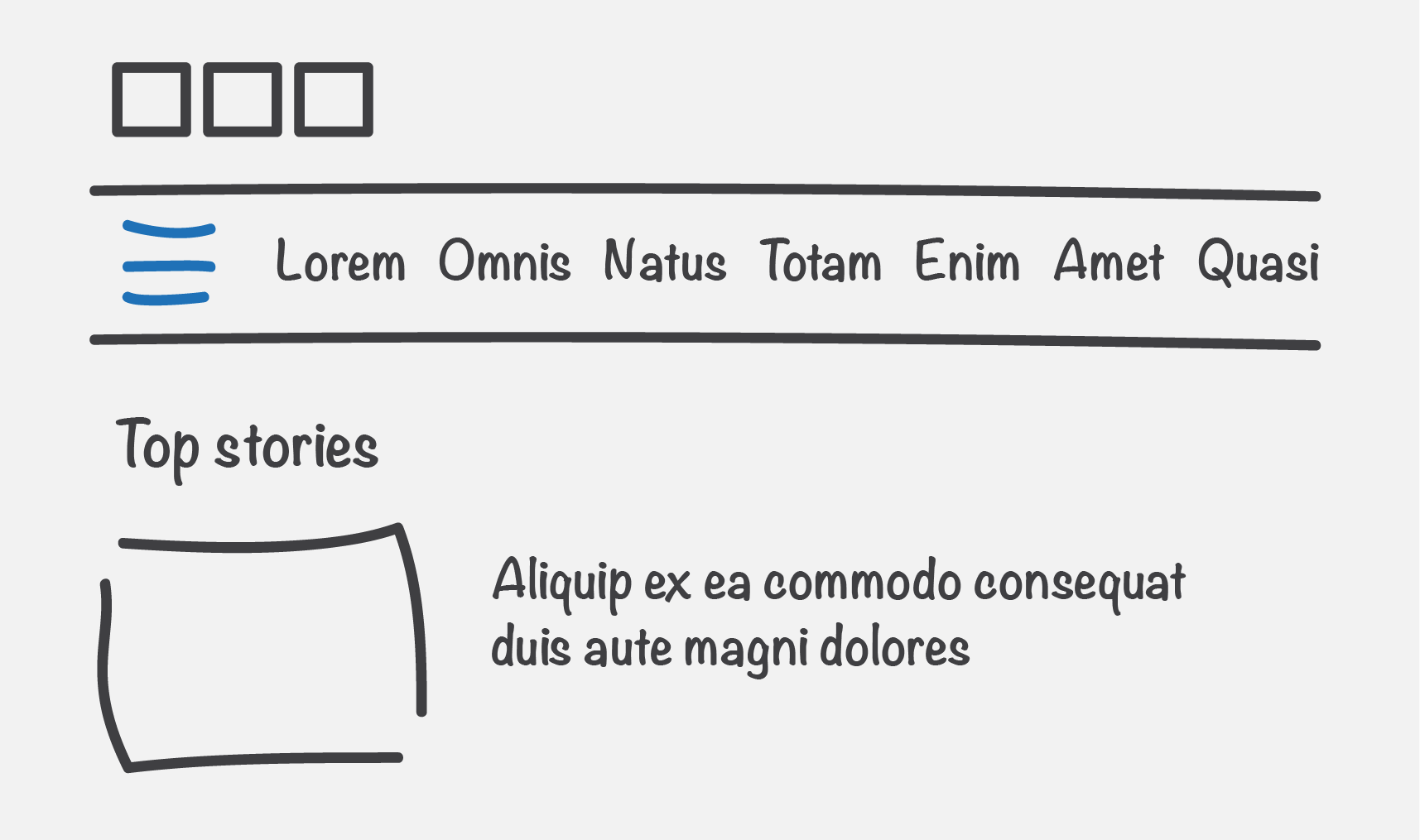
Example 1 - P1
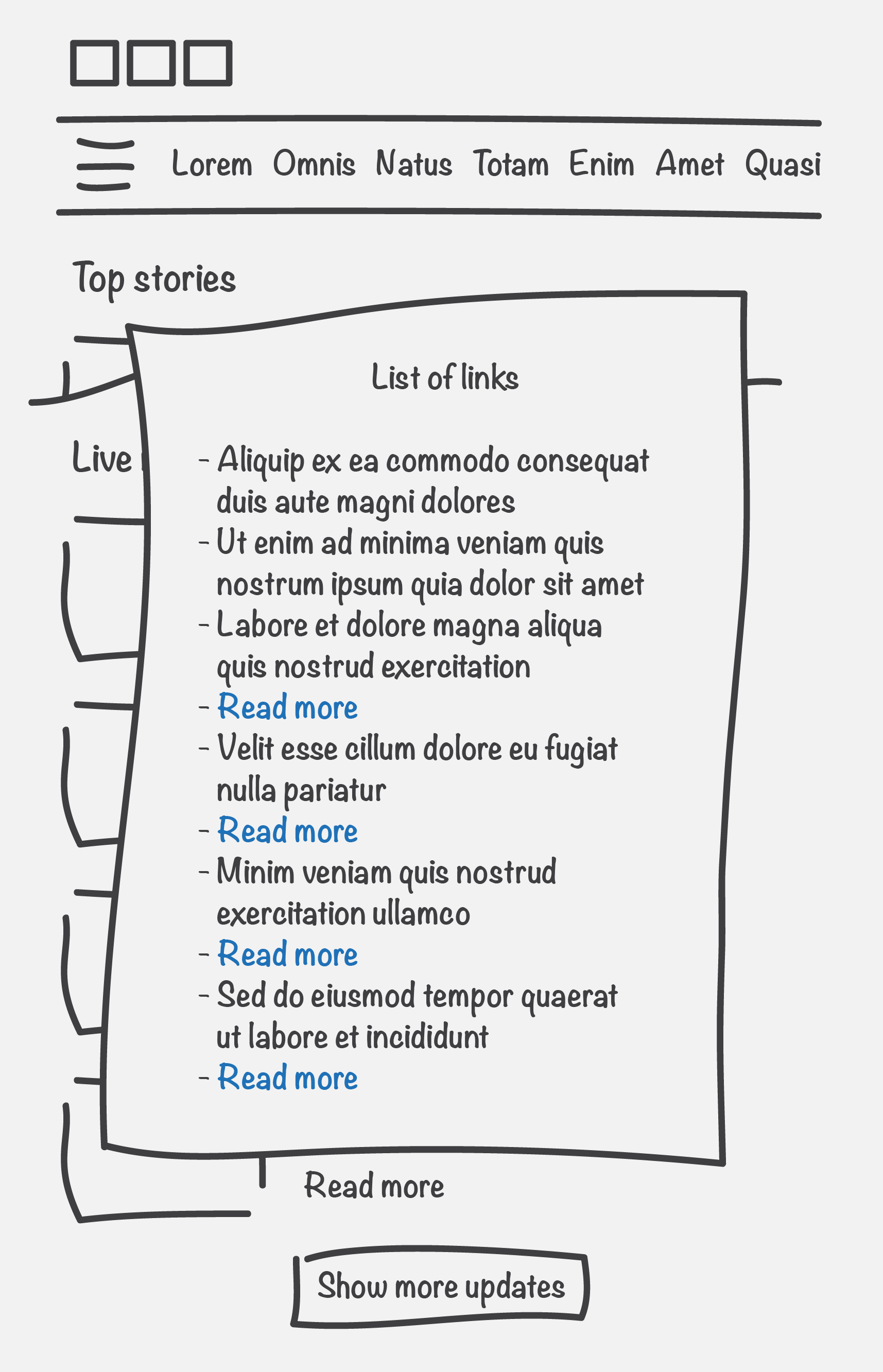
As a screen reader user, when navigating through the homepage, a heading is announced for ‘Top stories’, though I cannot see any of the top stories.
Why is this a P1? The user can't access content, in this case the top stories. Solution: Remove the code that is causing this content to be hidden to screen readers, such as an aria-hidden attribute.
Example 2 - P1
As a keyboard only user, when I press the ‘tab’ key to move between actionable elements on a page, such as links and buttons, I cannot tab to the ‘Menu’ button in the banner, and therefore cannot access the menu items.
Why is this a P1? The user can't access content, in this case some of the index pages of the website can’t be navigated to. Solution: Add the ‘Menu’ button to the tab order by using the appropriate semantic HTML element e.g. a button.
P2 accessibility bugs
- Make something harder
- Mean the user can access content though it's hard or causes annoyance
- Should be fixed prior to release (though on some occasions this might mean being live with a bug for a short period of time)
- Product decision whether to release with a P2 bug
- Aim to have as few of these as possible
P2 bug examples
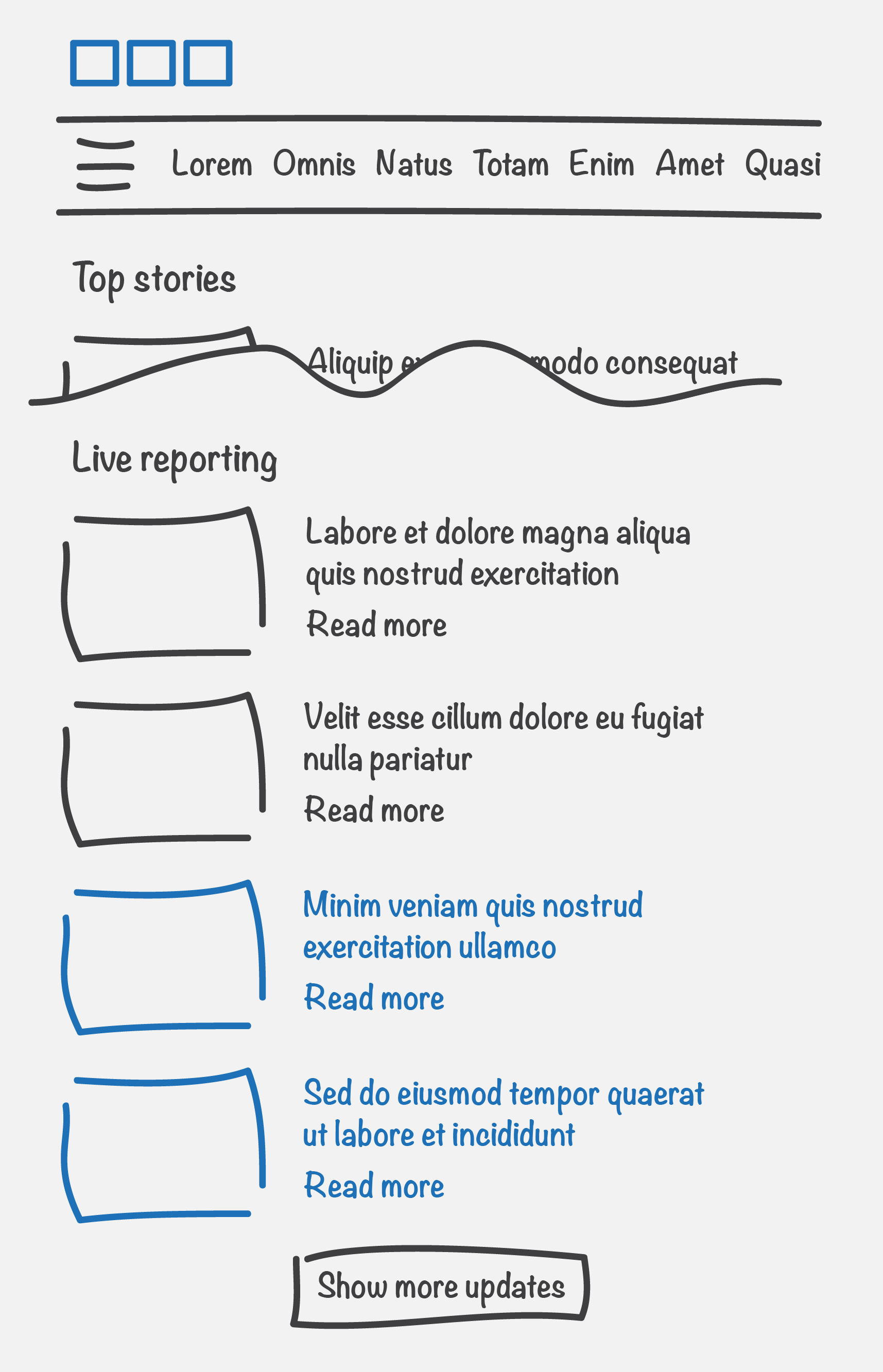
Example 1 - P2
As a keyboard only user, when I activate the ‘Show more updates’ button, keyboard focus is taken to the top of the page.
Why is this a P2? The user can access content though it's hard or causes annoyance. After activating the ‘Show more updates’ button, the user has to navigate to the newly shown updates by starting their journey again from the top of the page, if the user isn’t a sighted user, they also have to identify the new content themselves. Solution: When the ‘Show more updates’ button is activated, move keyboard focus to the newly shown updates.
Example 2 - P2
As a screen reader user, I can navigate via the menu or list of links, this contains all the links that are on a given page. When I navigate to a ‘Read more’ link in this list, I am not sure what I would read more about. I also cannot distinguish the content of this link from the other 3 links in the list which are also described as ‘Read more’.
Why is this a P2? The user can access content though it's hard or causes annoyance. As a screen reader user if I am navigating via the menu or list of links, I may not know the context of a link and it can cause annoyance if I have to activate a link to identify the content of it. Solution: Make link text descriptive and if link text is duplicated on a page, ways of making each link unique must also be used, for example, by using an aria label or visually hidden off screen text.
P3 accessibility bugs
- Minor usability issue
- Mean the user can access content though there is a minor usability or user experience issue
- Could be fixed prior to release if time allows, alternatively at a later date
- Product decision whether to release with a P3 bug
- Aim to have a comparable UX for all users
P3 bug examples
Example 1 - P3
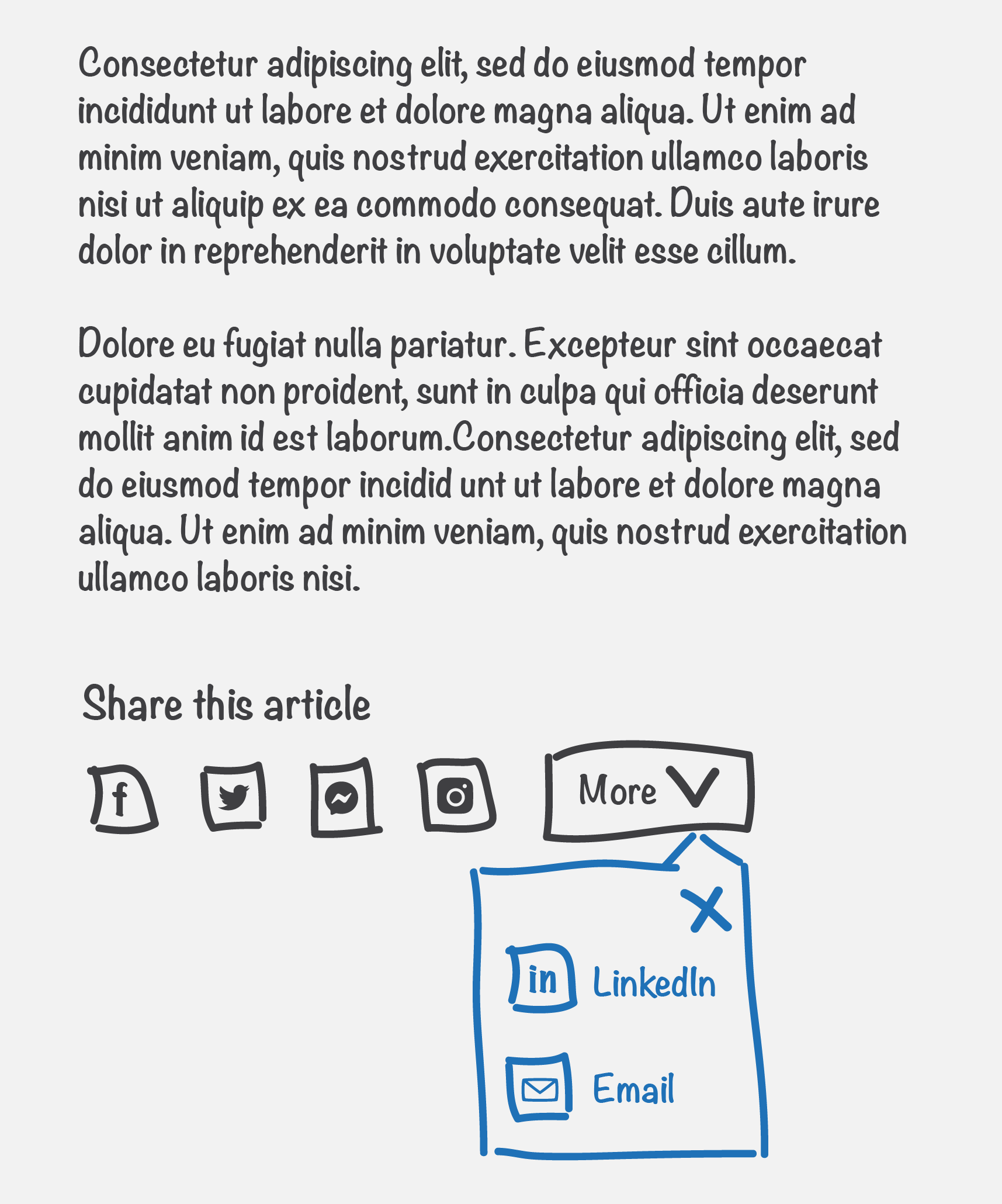
As a screen reader user, when I navigate to the ‘Share’ button on an article page, it does not announce if the content of the popup button is already displayed.
Why is this a P3? The user can access content though there is a minor usability or user experience issue. As a screen reader user, it would improve my user experience if the screen reader announced if the content of the popup button was expanded or collapsed. Solution: Add an aria-expanded attribute to the button element.
Example 2 - P3
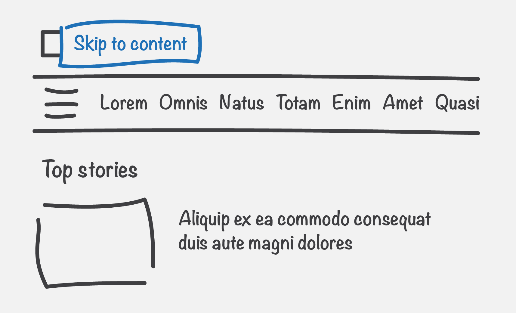
As a keyboard only user, when I press the ‘tab’ key to move between actionable elements (such as links and buttons) on an article page, there isn’t a ‘Skip to content’ link in the banner, like there is on other pages, such as the homepage.
Why is this a P3? The user can access content though there is a minor usability or user experience issue. As a keyboard only user, it’s not a consistent experience site wide, on some pages there is a skip link and some pages there isn’t, this is inconsistent and confusing. Solution: Add the ‘Skip to content’ link to the banner on all pages. When the user activates this link, it should always take the user to the start of the main content.