User experience designers guide, How to document the screen reader user experience
User experience designers are responsible for designing the user experience. Period. A visual is not enough. This doesn't ensure a good user experience (UX) for all users. Accessible design process includes documenting the non-visual UX, for screen reader users. This also helps in achieving a good user experience for other types of assistive technology users.
This guide aims to demystify an area that can often be seen as daunting. If you don’t know where to start or maybe weren’t aware that this was your responsibility, then this guide will introduce you to concepts of screen reader UX and how to document this for your component. It’s actually fairly straight forward, and just an extra step to your process. It’s ok to concentrate on the visual user experience first, you’ve got to start somewhere, though always try to keep the screen reader UX in mind.
This guide won’t necessarily teach you how to make your user experience accessible or what best practice might be for your component. This is where accessibility guidelines come into play, such as the BBC Mobile Accessibility Guidelines or WCAG. Consult guidelines as part of your process. And also consider other types of assistive technology users.
Thinking about everything at once can be overwhelming. Let’s focus on the screen reader UX. Using your visual as a starting point, this guide takes you step by step through how to document this for web based content. For native app based content see the iOS and Android guide.
Don't leave it to chance
- Knowledge - Like designers, engineers have different skill sets. Some know more about accessibility than others. This documentation will enable you to better communicate and collaborate with engineers.
- Interpretation - By looking at a visual, many engineers will be able to interpret the screen reader UX. Though their interpretation may not be the same as what you had intended.
- Creative license - Visual styling doesn’t always follow the rules. For example, as part of a component you might have a heading which has low key styling, as you didn’t want to draw attention to it. Don't assume an engineer will know that this is a heading if it doesn’t look the same as other headings.
- Consistency - You cannot assume that all engineers will interpret a visual in the same way. If you work in a large team, it’s more than likely multiple engineers will work on your component.
7 top tips
- Components not pages - Document at component level, as you would for the visual UX.
- Context - Don’t forget to consider the context of the component at the page level. This is particularly important when considering heading and landmark structure.
- Consistency - Ensure you have a consistent user experience. Consistency is good for all users, both at component and page level.
- Verbosity - Be careful not to make the screen reader UX more verbose than it needs to be. This should be of a similar level to that of the visual UX.
- Engineers are your friends - If it’s a complex component collaborate with an engineer to document the screen reader UX. Engineers may be able to suggest approaches that you may not have considered. This also makes an excellent starting point for collaboration with engineering.
- Use a screen reader - Get to know your users. Designing an iteration? Have a go using the testing steps to navigate through the existing iteration. The testing steps enable anyone to use any of the supported assistive technology for the first time.
- Always - It’s always important to document the screen reader UX, even if it's a small simple component.
Step by step
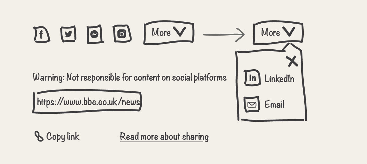
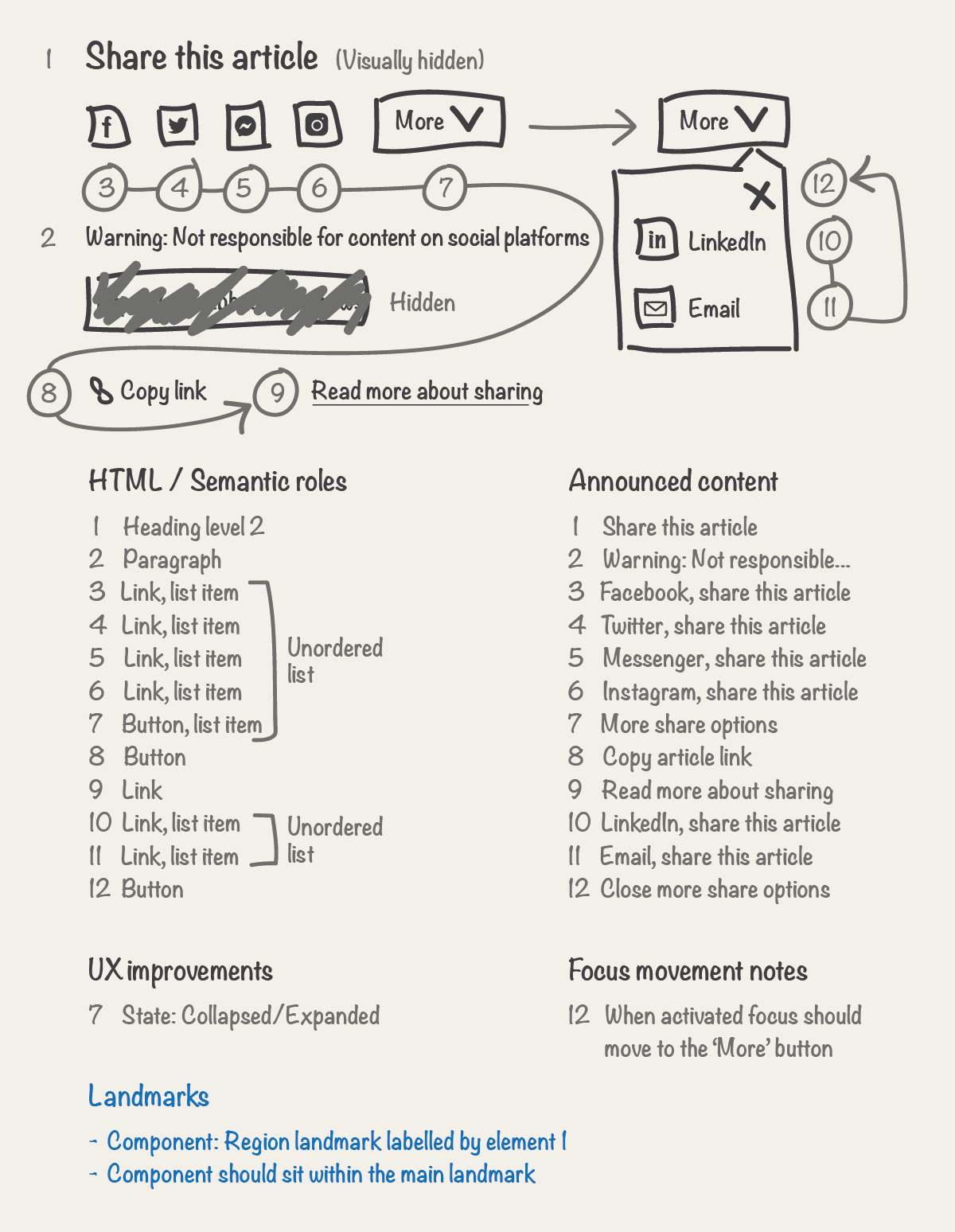
Using your visual as a starting point, we’ll take you step by step through how to document the screen reader UX introducing concepts along the way. We’ll be using a fictional ‘Share’ component as an example.
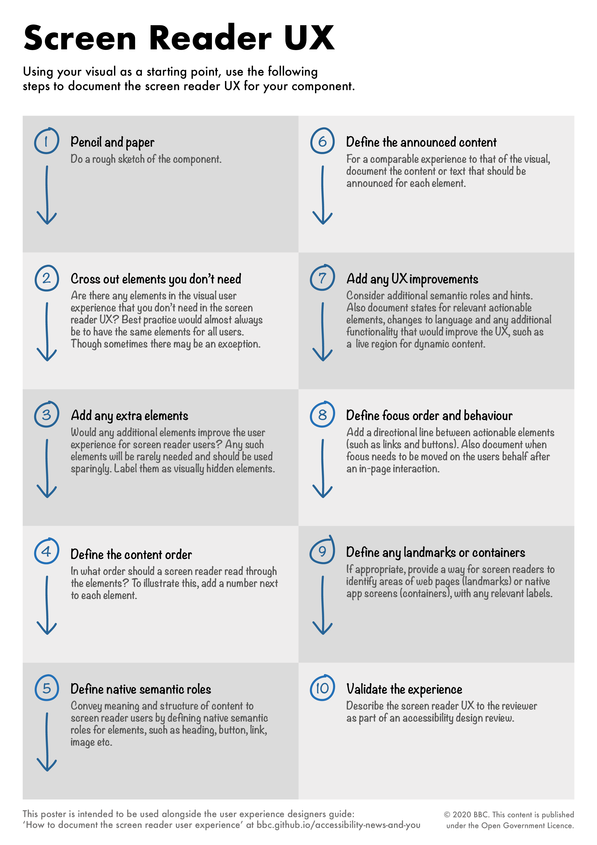
Step 1 - Pencil and paper
Like a visual, you might not get this right the first time, doing this with pencil and paper will save you time. You can then document the results in a digital format afterwards.
So lets start! Grab a pencil or pen if you prefer… Then do one of the following:
- A rough sketch of the component (similar to the sketch of our example ‘Share’ component)
- Print a wireframe
- Print a visual
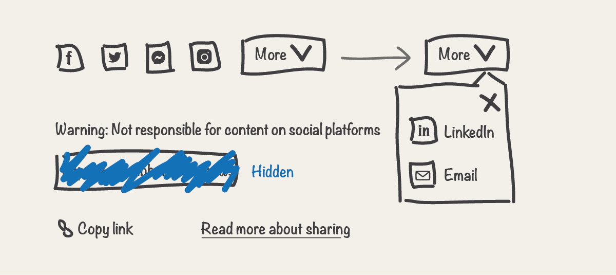
Step 2 - Cross out elements you don’t need
Are there any elements in the visual user experience that you don’t need in the screen reader UX? For example, an element that might not be relevant or make sense, or an element that doesn't add anything to the user experience, for a screen reader user.
Best practice would almost always be to have the same elements for all users. Though sometimes there may be an exception, as user needs in the visual and non-visual UX can vary, the UX should be comparable. Before crossing out an element, question why one user group would have an element and not another. Also keep in mind that you will be hiding this content from other assistive technology, such as speech recognition and reading solutions.
Cross out elements you don't need and label them as hidden elements. They will still form part of the visual user experience. In our example ‘Share’ component, the input field element containing the url of the link is for illustrative purposes, so we’ll cross this out.
Other examples of elements you might not need
Images
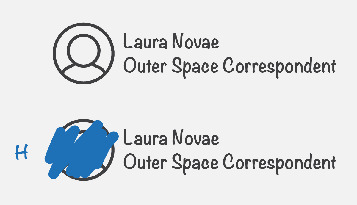
Is there a decorative or presentational image which doesn’t need alternative text (alt text)? Or an image that would repeat associated text content? For example, in the case of an article byline the portrait photo might not need alt text if it would repeat the text next to it e.g. the name of the author.
Alternatives
Is there any content that you are providing an alternative for? Such as an interactive map that can't be accessible.
Step 3 - Add any extra elements
Would any additional elements improve the user experience for screen reader users? Any such elements will be rarely needed and should be used sparingly.
Like the previous step, best practice would almost always be to have the same elements for all users. Before adding an extra element, question why one user group would have an element and not another. Also keep in mind that it's easy to forget extra elements are there, as you can’t see them, in a future iteration these elements could be forgotten about and no longer make sense.
Draw on any extra elements, and label them as visually hidden elements, as we don’t want to add them to the visual user experience. In our example, we’ll add a heading element so screen reader users can easily identify and find this content. Don’t forget to consider the context of the component at the page level. A heading element may not be appropriate for all ‘Share’ components.
Another example of an extra element
Skip links
Skip links are visually hidden by default and will form part of the screen reader UX. Screen reader users who use a keyboard, along with other keyboard users can press the ‘TAB’ key to navigate through actionable elements on a page, such as links and buttons. These are also referred to as focusable elements. Skip links enable keyboard users to skip or bypass content when there is a good reason to do so. They should be used sparingly. A good example would be a 'skip to content' link. This enables a user to bypass a website’s navigation and go straight to the main content of a page. This would otherwise be repetitive for keyboard only users to navigate on all pages of a website. All focusable elements should be displayed when they receive focus. This means ‘skip links’ will also form part of the visual user experience when they receive focus.
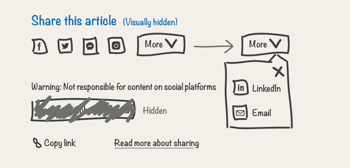
Step 4 - Define the content order
In what order should a screen reader read through the elements? To illustrate this, add a number next to each element. Always try to make the order of elements match the visual order. A mismatch could lead to confusion for some users, such as a sighted screen reader user. It will also make building the component more complex.
On occasion, there may be times when the desired visual order just can’t give a good experience for a screen reader user. In our example, the ‘X’ close button is visually displayed on the top right as is best practise. It may not provide the best screen reader UX to have this content announced before the other share options. So on this occasion we'll change the content order for screen reader users.
Another example is information that is key to an interaction. In our example, the text “Warning: Not responsible for content on social platforms” is such a case. Inorder for a screen reader user to make an informed decision, this information should be read before the share links. Ideally this warning text should be displayed before the links in the visual too, as this would help other users as well.
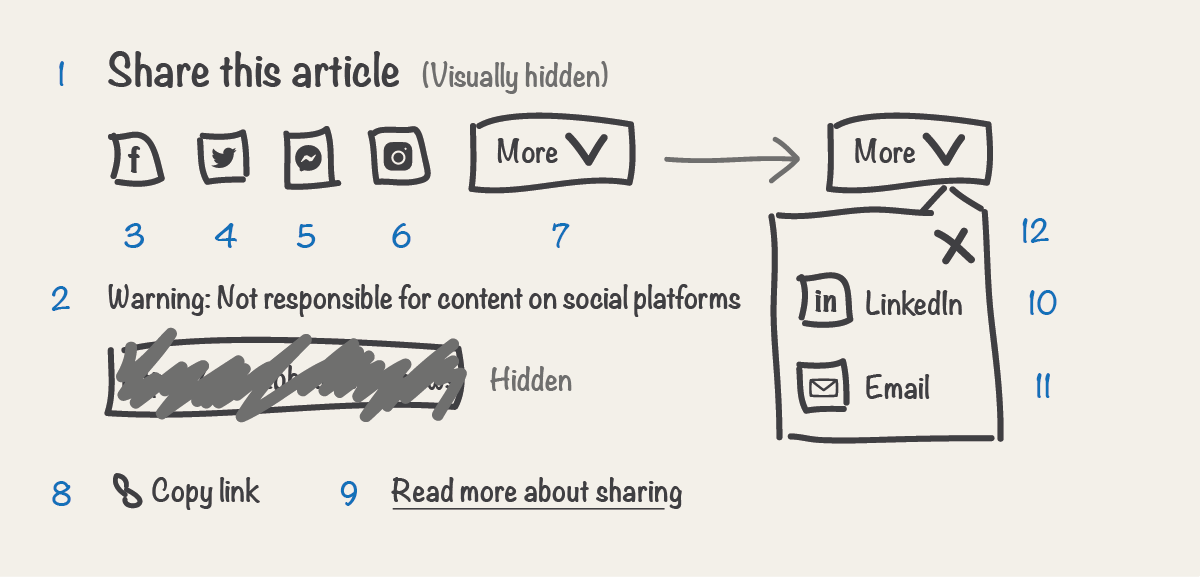
Step 5 - Define native semantic roles
In a well designed visual user experience, a sighted user should be able to identify elements and their semantic roles along with any expected behaviours by simply looking at them. For example, when viewing an article, you can usually identify text that has a semantic role of heading because the font size of it is larger than that of surrounding text. For screen reader users you need to convey this in another way, by using meaningful code. This is often referred to as semantic code.
Semantic code defines the roles of elements and relationships between elements, which then conveys the meaning and structure of content to screen reader users. This is usually conveyed to the user alongside the announced content of elements. This also tells the screen reader how elements behave or should be treated.
HTML primarily defines the semantic roles of elements and structure of web content. You don’t need to know how to write the code, however some basic knowledge will be an advantage.
Think about every element in your component and the associated semantic roles for the non-visual user experience. Consider what HTML element is the most appropriate to convey the meaning you had intended from the visual styling. This is referred to as the use of semantic HTML. Strip away the presentation styling and what are you left with? A heading, an image, a link, a button etc.
If your component includes a common design pattern, such as tabs. If available, use a technical guide as a starting point. Such as the BBC GEL technical guide for tabs or WAI-ARIA Authoring Practices tabs design pattern. Reference any used documentation so engineers can follow a best practice accessible implementation.
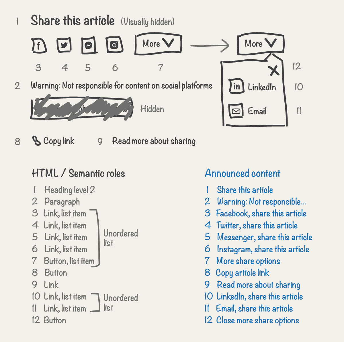
Define native semantic roles by documenting the HTML for each element. In our example, we’ll define native semantic roles via HTML elements of heading level 2, paragraph, link, button, unordered list and list item.
Which HTML elements are the most appropriate
Use common HTML elements. There are over a hundred HTML elements you can use. However many of them are not well supported by screen readers. Not sure which HTML elements to define? Collaborate with an engineer. You will usually only need to use a handful of common elements from the following, most of which are well supported by screen readers.
| Element | Code | Semantic role announcement |
|---|---|---|
| Header | <header> |
Banner |
| Navigation | <nav> |
Navigation |
| Main | <main> |
Main |
| Section | <section> |
Region |
| Aside | <aside> |
Complementary |
| Footer | <footer> |
Content information |
| Element | Code | Semantic role announcement |
|---|---|---|
| Heading | <h1> to <h6> |
‘Heading’ with the corresponding level. Such as ‘heading level 1’. |
| Unordered list | <ul> |
List semantics are announced. The exact announcement varies depending on screen reader. |
| Ordered list | <ol> |
List semantics are announced. The exact announcement varies depending on screen reader. |
| List item | <li> |
List item semantics announced by some screen readers. The exact announcement varies depending on screen reader. |
| Link | <a> |
Link |
| Button | <button> |
Button |
| Image | <img> |
'Image' or 'Graphic' depending on the screen reader |
| Figure | <figure> |
'Figure' announced by some screen readers |
| Figure caption | <figcaption> |
Caption semantics announced by some screen readers. The exact announcement varies depending on screen reader. |
| Time | <time> |
'Time' announced by some screen readers |
| Paragraph | <p> |
Semantics not announced |
| Italic | <i> |
Semantics not announced |
| Emphasis | <em> |
Semantics not announced |
| Bring attention | <b> |
Semantics not announced |
| Strong | <strong> |
Semantics not announced |
| Block quote | <blockquote> |
'Blockquote' announced by some screen readers |
| Thematic break | <hr> |
Seperator |
| Description list | <dl> |
Semantics announced by some screen readers. The exact announcement varies depending on screen reader. |
| Details | <details> |
Semantics announced by some screen readers. The exact announcement varies depending on screen reader. |
| Table | <table> |
'Table'. Table content should also be specified and roles announced. |
| Form | <form> |
Semantics not announced. Form content should also be specified and roles announced. |
More information on semantics
Link vs button
It’s important to use the correct semantic role for the job. Links and buttons have different behaviours which have well established user expectations. Such as being able to activate a button by pressing the spacebar on a keyboard. Use a link if you will be taken to a new url upon activation. Use a button to submit a form or for an in-page interaction. The only exception is an in-page anchor link, which takes you to another part of the same page upon activation. The clue is in the name here - this is a link element.
Perceived affordance
Semantic roles communicate the meaning of content to screen reader users. They also communicate expectations. For example when an element is interacted with, such as link vs button. Expectations aren't only important for screen reader users. Visual styling gives sighted users an expectation and a perceived affordance. Visual styling should communicate the semantic meaning of HTML elements. For example, interactive elements should look like interactive elements. If you don't have perceived affordance this may cause issues for some users. For example, those using speech recognition assistive technology, rely on being able to visually interpret meaning and behaviour to know what they can interact with and how, via speech.
No appropriate semantic element
In this case a div or span HTML element can be used. An engineer can decide which is the most appropriate. No semantics will be announced from either. For example, in an article, before the body copy, you might have a heading level one (h1) with a label below that, such as a topic tag. The topic tag isn't part of the heading, and it's not a link, nor is it a paragraph of text. There isn’t an appropriate semantic element in this case.
Why aren’t semantics conveyed at the paragraph level?
This is largely down to frequent use of such elements. And in some cases a history of incorrect semantic use on the web, such as that of the <b> tag. Semantics in such cases could clutter and confuse a screen reader user's experience. It is however always important to use the appropriate HTML element. One day the semantics of these elements might be announced. And also screen reader users can navigate by element type, such as via headings or paragraphs etc.
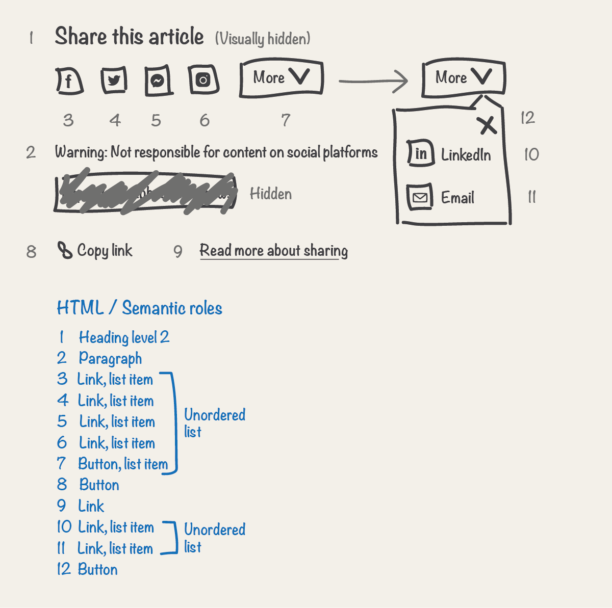
Step 6 - Define the announced content
When a screen reader encounters an element with a semantic role, meaning is usually conveyed. The screen reader will also announce the content of the element. For example, when a screen reader encounters an element with a semantic role of heading (h1) and content of ‘Screen reader UX’. The combined announcement of semantic role and content would result in ‘heading level 1, Screen reader UX’ or ‘Screen reader UX, heading level 1’ depending on the screen reader. Like web browsers, screen readers can behave slightly differently.
For a comparable experience to that of the visual, you should document the content or text that should be announced for each element. This should include images and icons, in such cases this is often referred to as a textual alternative or alternative text. You have already documented semantics by defining native semantic roles via HTML elements.
You might want to announce extra text content to that of the visual. For example, to provide context, which might be obvious or not relevant in the visual user experience. Extra text is usually referred to as visually hidden text, as it doesn't form part of the visual user experience. An engineer can decide what is the most appropriate way to implement this, usually by applying CSS or an aria-label to elements. Use extra text sparingly and only when absolutely necessary.
Document what content should be announced for each element. In our example, in addition to the text in the visual, we’ll also document extra text for some elements to provide context. Along with the announced content for icons and images.
Other considerations for extra text
- Development - Extra text can add complexity to the code which might mean it’s harder to maintain.
- Editorial - Editorial may not be aware of extra text content. And in some cases be able to add content that doesn’t make sense combined with this.
- Future iterations - It's easy to forget that extra text content is there, as you can’t see it. In a future iteration this information could be forgotten about and no longer make sense.
- Complexity - Extra text could cause confusion and add to complexity for some users. For example a sighted screen reader user could see one thing but hear another.
- Localisation - Extra text may need to be translated into many different languages. This can also add extra complexity to the code if required for multiple languages with different sentence structures.
- No CSS - CSS could be unsupported, removed or not load for a user with a poor internet connection. In these cases, if implemented with CSS, extra text will be displayed in the visual user experience.
Other examples of announced content
Context
In our example, there’s a button with text of ‘More’. We could just announce this content. However, a screen reader user may need extra information to be sure what they’re going to be shown more of. So we’ll provide some by announcing ‘More share options’. This is especially useful when elements are navigated to out of context. For example, you can navigate solely through buttons on a page, in which case 'More' wouldn't mean much without knowing the context. Ideally you should also visually display this text, as this would be useful for everyone.
Icons
If an icon is key to understanding, it will need some text content announcing for it, that communicates its meaning and purpose. This is referred to as a textual alternative. For example, if an icon, such as a video play button, doesn’t have any associated text that conveys its meaning and purpose, a textual alternative would be needed for a screen reader user. In our example, the ‘X’ close button would be such a case. We could just announce ‘Close’, though this doesn’t give any context. So we’ll provide some by announcing ‘Close more share options’.
Images
The announced content for an image is the alternative text (alt text) that is provided for this. This should describe the image.
Key information
Try to provide key information first for text alternatives. This will aid browsing of content so users don't have to always listen to the full text. In our example, the function of link elements 3 to 6 is to share an article. To uniquely describe the target of each link, we also need to announce the social platform. The social platform distinguishes this from the other share links so we'll announce that first. We can then announce the function or context afterwards. For example 'Facebook, share this article'.
Abbreviations
Commonly known and spoken
Abbreviations which are commonly known and spoken do not need unabbreviated announced content. For example GMT is an abbreviation for Greenwich Mean Time. The abbreviation of this is commonly spoken.
Commonly known but not spoken
Abbreviations which are commonly known but not usually spoken, should have unabbreviated announced content. Or preferably be unabbreviated as this would be helpful for other users as well, such as those with a learning impairment. For example the date ‘Thursday 18th December’ is commonly abbreviated to ‘Thur 18th Dec’. Though you would not say ‘Thur’ or ‘Dec’ even if it was written like that. Another example would be an abbreviated timestamp of ‘1h’, this is an abbreviation for ‘1 hour ago’. Providing both abbreviated and unabbreviated content is also a less than optimal code solution.
Not commonly known
Abbreviations which are not commonly known should have unabbreviated announced content. Or preferably be unabbreviated as this would be helpful for all users.
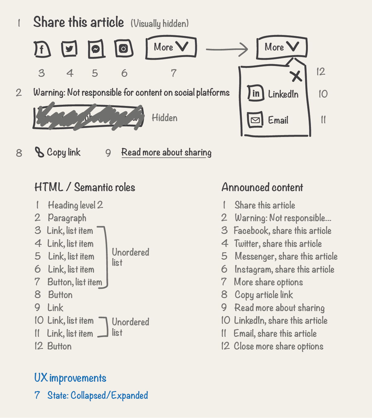
Step 7 - Add any UX improvements
Improvements should be called upon sparingly. They are particularly relevant for in-page interactions and dynamic content. In our example, the 'More' button has a downwards arrow icon. This is a visual clue for sighted users. Giving a hint to the behaviour of the button upon activation, this is also known as an affordance. Could the non-visual UX be improved by providing a comparable affordance for the button behaviour?
Consider every element and document any desired UX improvements. Consider UX improvements such as additional semantic roles and affordances. Also document states for relevant actionable elements, changes to language and any additional functionality that would improve the UX. While you can, you do not need to define any ARIA specifics. Let an engineer consider the best technical approach, or collaborate. In our example, for the 'More' button, we’ll let users know if the content that the button controls is currently expanded or collapsed.
Additional semantic roles
If appropriate provide additional semantic roles that would improve the user experience, that could not be defined by native semantic roles via HTML elements. Use any additional semantic roles sparingly.
- Tabs - This may be particularly relevant for tabs. Tabs display content via panels, one at a time. Document any additional semantics that would improve the UX.
- Not needed often - Additional semantic roles will not be needed often. The W3C has a list of additional semantic ARIA roles that can be applied to HTML elements, including some of those that can be achieved natively via HTML.
Affordances
Affordances can be used to communicate expectations and help users understand what will happen when they perform an action on an element. Always use a consistent approach for affordances, both at component and page level.
The W3C has a list of ARIA properties that can be applied to HTML elements to provide affordances, including some of those that can be achieved natively via HTML.
States
States should be provided to improve the UX of relevant actionable elements, such as those of buttons and checkboxes. In our example, the ‘More’ button is such an example. Providing an expanded or collapsed state affordance would improve the UX. This will result in a combined announcement of content, semantic role and state. When in a collapsed state of ‘More share options. Button. Collapsed’ and when expanded ‘More share options. Button. Expanded’.
You will usually only need to use a handful of states from the following:
- Checked - Indicates the state of checkboxes and radio buttons.
- Collapsed - Indicates content is currently collapsed. For coding details see aria-expanded.
- Current - Indicates that an element represents the current item within a set of related elements. For example to indicate the currently displayed page in a navigation menu. For coding details see aria-current.
- Disabled - Indicates that an element is disabled.
- Expanded - Indicates content is currently expanded. For coding details see aria-expanded.
- Pressed - Indicates the state of a toggle button. For coding details see aria-pressed.
- Selected - Indicates that an element is currently selected, such as a tab. For coding details see aria-selected.
The W3C has a list of ARIA states that can be applied to HTML elements, including those that can be achieved natively via HTML.
Language
Note any changes in language to content, this will aid a screen reader in announcing the content with the appropriate accent.
Additional functionality
If appropriate, also provide additional functionality that could improve the screen reader UX, such as a live region for dynamic content:
- Notify users of new or updated content without interrupting the user's current task - For example, in the case of a news update being added to a page or screen. Without a notification screen reader users may be unaware of this. Notify the user of the new content when they have finished their current task.
- Notify users of new or updated content immediately - For example, in the case of an error message being added to a screen. Without a notification screen reader users may be unaware of this. Notify the user of the new content immediately (this behavior may not be desired for all error messages).
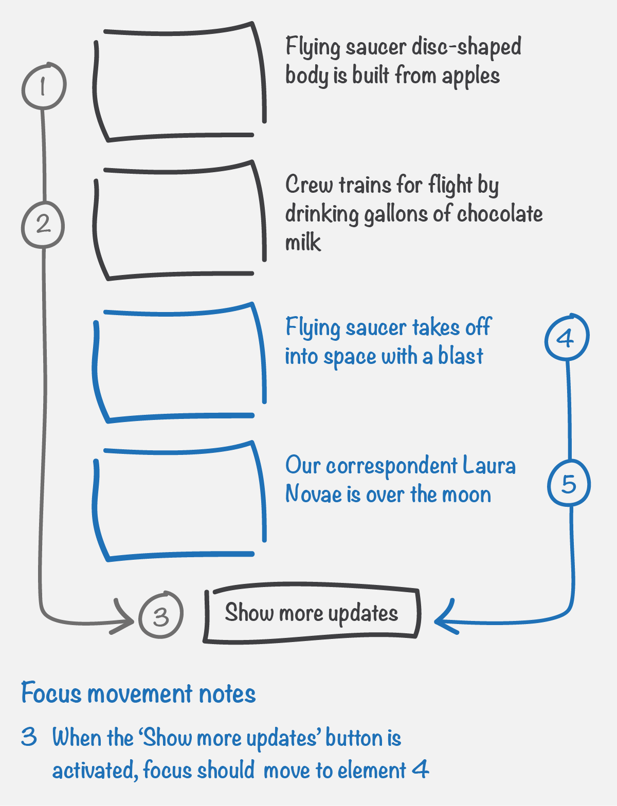
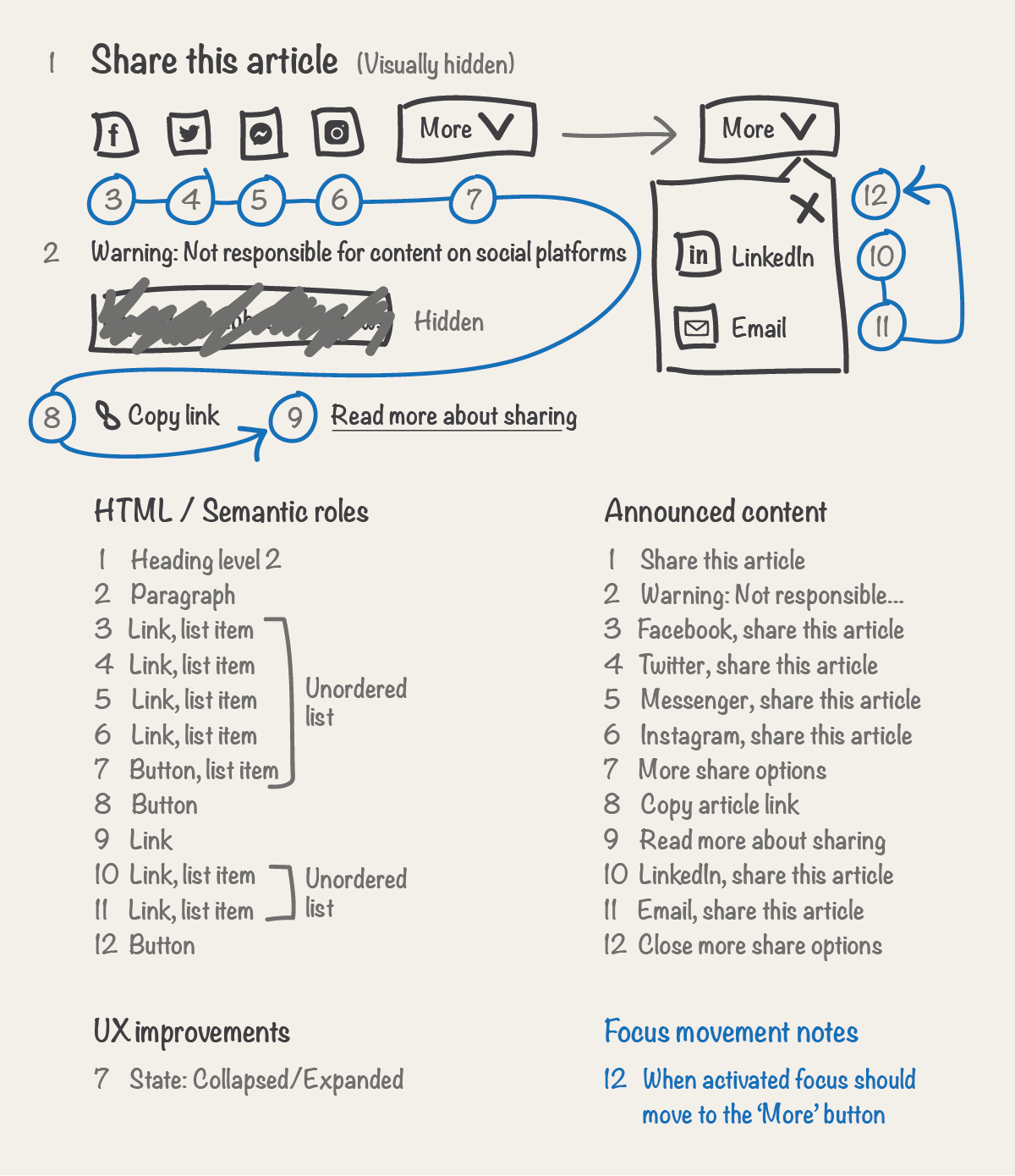
Step 8 - Define focus order and behaviour
All actionable elements, such as links and buttons, are by default focusable with a screen reader and other assistive technologies such as switch devices. The order in which these elements can be focused and interacted with, for example with a keyboard by pressing the ‘TAB’ key, is important to consider. This order is referred to as the focus order or sometimes the tab order. All focusable elements should be visually displayed when they receive focus, and this order should follow a logical sequence. This is usually expected visually from left to right as you move through elements and down a page. Though there will be some exceptions to this. This order is by default defined by the content order.
Define the focus order by adding a directional line between actionable elements. Also document when focus needs to be moved on the users behalf after an in-page interaction. In our example, in addition to defining the focus order, we’ll also add some notes on focus movement for the 'Close' button upon activation.
Moving focus on the users behalf
It’s important to consider when focus needs to be moved on the users behalf after an in-page interaction. Interactions should follow a logical sequence and provide a good user experience. For example, if a ‘Show more updates’ button is activated and new content is inserted above the button, by default focus would remain on the button after activation, this would be a frustrating experience for assistive technology users, who would then have to identify the start of the new content and navigate to it. In this example, to improve the UX, focus should be moved on the users behalf to the new content upon activation of the button.
Step 9 - Define any landmarks
Typically we use colour or other styling to identify areas of web pages visually. For example, the BBC News website has a red block at the top. Visually this groups and identifies the page banner content. In the non-visual experience, you need another way to do this.
Landmarks provide a way for screen readers to identify areas of web pages. This enables users to identify and navigate to areas of a page.
Note, landmarks are different to headings. Use the ‘show landmarks’ and ‘show headings’ buttons at the top of the ARIA landmarks examples page to see how.
If appropriate document any landmarks and associated labels for your component. Also make a note of any landmarks your component should sit within if relevant. There are 8 landmark roles that you can use. Use the steps in the General Principles of Landmark Design to decide if a landmark is appropriate for your component and/or part of it. This won't always be necessary. In our example, we’ll add a fictional region landmark.
Step 10 - Validate the experience
Validate the screen reader user experience by describing this to the reviewer as part of an accessibility design review.
Back to page contentsNext steps
When the screen reader UX has been documented an accessibility design review can take place. The next step in achieving an accessible component is writing accessibility acceptance criteria. For which, this documentation along with your visual will form a basis for. Your component is then ready for the development phase.
Back to page contentsUX review
When the component has been developed and is ready for UX review, an accessibility swarm is your chance to review and sign off the screen reader UX. Designers are responsible for reviewing the experience for all users, not just the visual UX. Use this documentation to review against.
Reviewing the HTML could be one step in your review process. This should never replace reviewing the user experience with a screen reader and other assistive technologies. You can review the HTML by inspecting the code in the browser. Not sure how, ask an engineer to show you. Check that the HTML matches what you documented. You might also see a number of additional div or span elements. These elements are mainly used to achieve layout and visual styling with CSS.
You might be curious to know what the documented screen reader UX for our example ‘Share’ component looks like in HTML. Let's take a peek at the code…
<section role="region" aria-labelledby="heading">
    <h2 id="heading" class="visually-hidden">Share this article</h2>
    <p>Warning: Not responsible for content on social platforms</p>
    <ul>
        <li>
            <a href="url">Facebook, share this article</a>
        </li>
        <li>
            <a href="url">Twitter, share this article</a>
        </li>
        <li>
            <a href="url">Messenger, share this article</a>
        </li>
        <li>
            <a href="url">Instagram, share this article</a>
        </li>
        <li>
            <button aria-expanded="true">
                <span>More</span>
                <span class="visually-hidden"> share options</span>
            </button>
            <ul>
                <li>
                    <a href="url">LinkedIn, share this article</a>
                </li>
                <li>
                    <a href="mailto">Email, share this article</a>
                </li>
            </ul>
            <button>Close more share options</button>
        </li>
    </ul>
    <button aria-label="Copy article link">Copy link</button>
    <a href="url">Read more about sharing</a>
</section>
If our example component was part of a website, when inspecting the code you might also expect to see a number of div and/or span elements in addition. Helping to achieve layout and visual styling with CSS.
Note, this guide takes one approach, there are other ways you could do this. Back to top