BBC iD Style Guide
All the elements in this style guide must follow BBC Accessibility Guidelines, for both desktop and mobile devices.
Index
Pages
About this StyleguideTypography
General font sizing and style for headings, paragraph text and links. For the purposes of this styleguide, the existing iD font sizing is shown. The spec below shows sizing for desktop/mobile, mapped to the closest GEL breakpoint. This will be updated to correspond to GEL typography guidelines soon.
Headings
This a heading h2
This a heading h3
This a heading h4
This a heading h5
Show styles
This is how headings are currently defined. They will be updating according to GEL guidelines.

GEL Group 1A:
H2 & H3 - font-size: 20px
H4 - font-size: 16px;
H5 - font-size: 13px;

GEL Group 1B & 2:
H2 & H3: font-size: 24px
H4 - font-size: 16px;
H5 - font-size: 13px;

GEL Group 3A, 3B & 4:
H2 & H3: font-size: 32px
H4 - font-size: 13px
H5 - font-size: 10px;

All GEL groups:
padding-top: 4px
padding-bottom: 4px
margin-top: 8px
margin-bottom: 8px
Paragraphs
This is a paragraph. For GEL group 4, there are 20 words maximum per line of text, to allow readability.
This is the second paragraph, that has 9 words.
This is the third paragraph. And because it has more than 20 words, it must split to a second line of text for 1007px+ devices.
This is an example of bold text in a paragraph.
Show styles
GEL Group 1A:
font-size: 13px
line-height: 16px
margin-bottom: 8px

GEL Group 1B & 2:
font-size: 16px
line-height: 20px
margin-bottom: 8px;

GEL Group 3A, 3B & 4:
font-size: 13px
line-height: 16px
margin-bottom: 12px;

All GEL groups:
font-family: Arial, sans-serif
Links
Show styles
GEL Group 1A:
color: #005383
font-weight: bold
text-decoration: none

GEL Group 1B & 2:
color: #005383
font-weight: bold
text-decoration: none

GEL Group 3A, 3B & 4:
color: #005383
font-weight: regular
text-decoration: none

All GEL groups:
a:hover - text-decoration: underline
Double Check
email@email.com
Show styles
GEL Group 1A:
font-size: 13px
line-height: 16px
margin-bottom: 8px

GEL Group 1B & 2:
font-size: 16px
line-height: 20px
margin-bottom: 8px

GEL Group 3A, 3B & 4:
font-size: 24px
line-height: 16px
margin-bottom: 16px
Colours
-
iD Header (1)
-
iD Header (2)
-
Links & 2nd CTA
-
Links (Hover)
-
Inactive CTA
Headers
iD-specific header with service name & logo.
SERVICE NAME
BBC iD
Show styles
GEL Group 1A:

	Header Bar:
	background: #1790CF
	padding: 0px 7px
	letter-spacing: -0.03em
	overflow: hidden
	max-height: 40px

	Heading H1:
	font-family: "Gill Sans"
	font-weight: 400
	font-size: 24px
	color: white
	line-height: 1.667em
	letter-spacing: -1px

GEL Group 1B & 2:

	Header Bar:
	padding: 0px 7px
	letter-spacing: -0.03em
	max-height: 42px

	Heading H1:
	font-size: 26px

GEL Group 3A, 3B & 4:

	Header Bar:
	padding: 0px 7px
	letter-spacing: -0.03em
	max-height: 42px

	Heading H1:
	font-size: 26px;

	Subheader:
	font-family: "Gill Sans", Arial, sans-serif
	font-size: 34px
	line-height: 2.25em
	letter-spacing: -0.01em
	color: #E0F4FF
	height: 66px
Panels
Panels act as containers for content. Layouts fall into 2 types:
- One column, full-width layout.
- Two columns layout.
Under GEL Responsive guidelines, all content uses a one column layout until breakpoint GEL Group 3B (content reflow), at which point some content (eg. forms) will use two columns.
The sections below outline the containers required for each layout.
One Column (Primary Column)
For content such as messages, which stay full-width across all breakpoints.
Layout:
Show styles
GEL Group 1A & 1B:
width: 100%
margin-left: 8px
margin-right: 8px

GEL Group 2, 3A & 3B:
width: 100%
margin-left: 16px
margin-right: 16px

GEL Group 4:
max-width: 976px; //1008px - 16px (left) - 16px (right)
margin-left: 16px;
margin-right: 16px;
Examples:
Message template

Message termplate with form elements

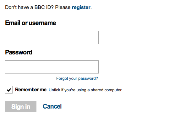
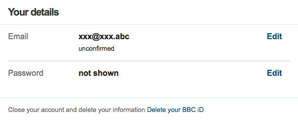
Two Columns (Primary & Secondary Column)
For content such as forms which transform from 1 column to 2. Left-aligned.
Layout:
Show styles
GEL Group 1A & 1B:
width: 100%
padding-left: 8px
padding-right: 8px

GEL Group 2 & 3A:
width: 100%
padding-left: 16px
padding-right: 16px

GEL Group 3B:
width: 62%; (widths must be expressed as percentage at this breakpoint to allow panels to stretch in proportion.
padding-left: 16px
padding-right: 16px
margin-right: 16px

GEL Group 4:
width: 645px;
padding-left: 16px;
padding-right: 16px;
Examples:
Registration form
Settings
Info Panel
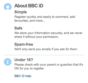
For secondary content such as information sections. Right-aligned.
Layout:
Show styles
GEL Group 1A & 1B:
width: 100%
padding-left: 8px
padding-right: 8px

GEL Group 2, 3A & 3B:
width: 100%
padding-left: 16px
padding-right: 16px

GEL Group 3B:
width: 36%; (widths must be expressed as percentage at this breakpoint to allow panels to stretch in proportion.
margin-left: 16px;
margin-right: 16px;
float: right

GEL Group 4:
width: 315px fixed width panels at this point.
margin-left: 16px;
margin-right: 16px;
float: right
Examples
About BBC iD
Page Icons
These icons appear in the primary column for message templates, only for GEL Group 4.
-

Captcha
-

Email
-

Error
-

Locked
-

Mail Problem
-

Out of Capacity
-

Parental
-

Question
-

Signed Out
-

Teapot
-

Valid
-

Warning
-

Wrench
Form Inputs & Labels
Responsive form inputs (text, password and date of birth). Fields stretch to 100% of viewport width until Group 3, where the form switches to a 'desktop' style layout with hints appearing to the right side of the fields.
CTAs
CTAs are part of form templates. They have padding at the top of their container to space them away from the content above.
Inactive
Show styles
GEL Group 1A:

	Primary CTA
	color: #FFF;
	font-size: 16px;
	background-color: #C0C0C0;
	padding: 0px 10px 0px 10px;

	Secondary CTA
	color: #005383;
	font-size: 16px;
	padding: 0px 10px 0px 10px;

GEL Group 1B, 2, 3A, 3B & 4:

	Primary CTA
	color: #FFF;
	font-size: 20px;
	background-color: #C0C0C0;
	padding: 3px 10px 5px 10px;

	Secondary CTA
	color: #005383;
	font-size: 20px;
	padding: 3px 10px 5px 10px;
Active
Show styles
Active (Primary CTA)
color: #FFF
background-color: #1790CF

Hover (Primary CTA)
color: #FFF
background-color: #005383

Secondary CTA keeps the same style.
Long Text
When the CTA text value is too long, the buttons wrap onto 2 lines when it doesn't fit the screen width.
Checkboxes
Desktop view (Groups 3A, 3B & 4) is currently achieved using spritesheet/CSS/jQuery. Smaller views use native checkbox element.
Show styles
GEL Group 1A, 1B & 2:

	Container:
	margin-below: 16px

	Label:
	font-size: 16px
	font-weight: bold

	Optional Note Text:
	font-size: 16px
	font-weight: Regular

GEL Group 3A, 3B & 4:

	Container:
	margin-below: 16px

	Label:
	font-size: 16px
	font-weight: bold

	Optional Note Text:
	font-size: 13px
	font-weight: Regular
Text Dropdown
Use progressive disclosure to reveal longer content as required.
This is some body text. Lorem ipsum dolor sit amet, consectetur adipisicing elit, sed do eiusmod tempor incididunt ut labore et dolore magna aliqua. Ut enim ad minim veniam, quis nostrud exercitation ullamco laboris nisi ut aliquip ex ea commodo consequat. Duis aute irure dolor in reprehenderit in voluptate velit esse cillum dolore eu fugiat nulla pariatur.
Excepteur sint occaecat cupidatat non
proident, sunt in culpa qui officia deserunt mollit anim id est laborum.
Show styles
Use standard type styles from typography section.
About this styleguide
The purpose of the styleguide is to provide both a reference source for developers when constructing BBC iD interfaces, and a 'playground' for designers wishing to see their designs working in a live, responsive context.
Note: This guide is not intended to be a source for production code. CSS specifications are expressed within the 'show styles' panel in each section.