
Carousels provide a handy way to navigate a list of items. They differ from Lists as the items scroll to a focus point rather then a focus point moving over the items.
Imagine a long strip of cardboard with a sequence of pictures drawn on it. If you took a piece of paper and cut a small window in it, then moved the strip of cardboard behind the paper, you would see the pictures scroll by. This is essentially how the Carousel works.
In TAL Carousels, the ‘window’ is a div called the ‘Mask’. The strip of cardboard is a div within the Mask called the ‘Widget Strip’. The pictures drawn onto the cardboard are individual Widgets, or carousel ‘Items’. The items are contained within the Widget Strip and may be divs or other elements.
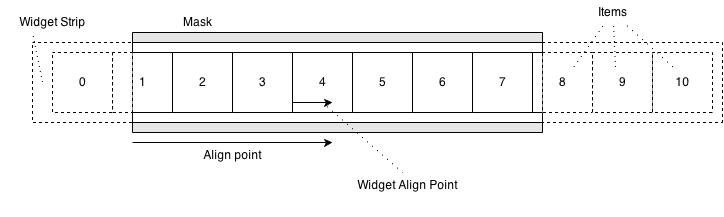
The above diagram shows how the various bits of the carousel fit together. The dotted area is hidden as it lies outside the mask.
Carousels can be arranged horizontally or vertically. Here is a vertical carousel
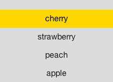
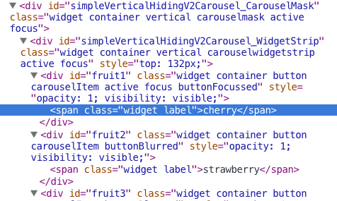
And here is a view of it’s structure in the DOM
The Carousel takes two parameters in its constructor, an id which will be used when constructing its constituent parts, and an orientation. Currently carousels can be vertical or horizontal, and these orientations are provided within a property of the Carousel class. If you do not explicitly provide an orientation the carousel will default to a vertical layout.
var carousel = new Carousel('someCarousel', Carousel.orientations.HORIZONTAL);Items can be added to the carousel using the standard container interface, for example
var carousel = new Carousel('theCarousel');
var widget = new Widget('someItem');
carousel.appendChildWidget(widget);
In contrast to the old horizontal carousel, the new carousel does not directly support data binding via its constructor. Instead you can use a Binder, which in turn calls appendChildWidget on the Carousel with each data bound widget.
var carousel = new Carousel('theCarousel');
var binder = new Binder(someFormatter, someDataSource);
binder.appendAllTo(carousel);When you create a carousel, you provide an id to the Carousel constructor. The id of the Mask and Widget Strip divs are derived from the one you provide. The mask has _CarouselMask appended and the Widget Strip has _WidgetStrip appended. In the example above ‘simpleVerticalHidingV2Carousel” was provided as the id. This gives each mask and strip a unique id within the document. In addition there are a number of css classes added to these elements:
Some basic styling is required for a carousel to work correctly. These style properties are deliberately not set by default to allow for flexibility in creating style sheets.
The mask needs to have overflow set. In general you’ll want this hidden so the strip can flow outside its bounds without visible scroll bars. You might want to set it to something else if modifying animation behaviour or targetting a touch device. The mask needs to have a fixed length - this is width for a horizontal carousel and height for vertical carousel. This is so that the carousel can efficiently determine which widgets are outside the mask.
The widget strip must have position set to relative to allow movement. Horizontal carousels need whitespace set to nowrap so that the items do not break onto multiple lines at the mask boundaries.
For horizontal carousels, items need display set to inline-block, for vertical carousels items should have display set to block - this is so they are laid out correctly.
Below is some example css for generic carousels
.carouselmask {
    overflow: hidden;
}

.carouselwidgetstrip {
    position: relative;
    white-space: nowrap;
}

.carouselwidgetstrip.vertical > .carouselItem {
   display: block;
}

.carouselwidgetstrip.horizontal > .carouselItem {
    display: inline-block;
}
And some additional, more specific css for the above example
#simpleVerticalHidingV2Carousel_CarouselMask {
    height: 300px;
    width: 50%;
    margin-left: auto;
    margin-right: auto;
    background: #DCDCDC;
    color: #1d1d1d;
    text-align: center;
}
The only essential part of this specific css is the height property, as this is a vertical carousel so the mask needs to have a fixed length.
Movement of the carousel is performed by calling its method, alignToIndex. This method takes an integer as it’s first argument. This is the index within the carousel of the widget you want to move the carousel toward.
Two points are defined:
The result of the alignment is to make the two points line up.
The alignment point along the mask can either be set in terms of pixels, or as a normalised value between 0 and 1, with 0 being the left or top edge and 1 being the right or bottom edge. Widget alignment points are always set using normalised 0 to 1 values.
As an example, if you wanted to focus the widget at index 4 so that it was centred in a carousel, you would call
carousel.setNormalisedAlignPoint(0.5);
carousel.setNormalisedWidgetAlignPoint(0.5);
carousel.alignToIndex(4);
If you wanted to align the right edge of the widget at index 3 to a point 300 pixels from the left edge of the mask, you would call
carousel.setAlignPoint(300);
carousel.setNormalisedWidgetAlignPoint(1);
carousel.alignToIndex(3);
By default both alignment points are set to 0, i.e. the left or top edge of the widget you align will be moved to the left or top edge of the mask
Two events are fired:
both have two properties
The second argument of alignToIndex is an animation options object, which you can use to configure how each alignment animates, for example:
carousel.alignToIndex(3, { duration: 500, easing: "easeInSine", skipAnim: false });Would align to item 3 over the course of 500ms using a sine easing function. Note that by default animation is skipped, so the skipAnim property needs to be set false if you want animation.
If you wish to interrupt an animation, you must call carousel.completeAlignment(). This instantly moves the carousel to the end of an inflight alignment. If you attempt an alignment while one is already in progress and do not call completeAlignment, the new alignement will be queued to execute after the current alignment is complete.
If you are going to hide, destroy, or render a carousel invisible, you should first call completeAlignment. If you do not and are are using the CSS3 animation modifier, callbacks may not being cleared up resulting in a memory leak. You can call this safely if no animation is in progress, it just wont have any effect.
There are two additional helper methods, alignPrevious and alignNext to facilitate simple two-key navigation. These methods share behavior with alignToIndex. They use align points in the same way, can accept an animation options object and do not affect the active item.
Unlike alignToIndex, these methods take into account any widgets that have been disabled and will skip over them. Additionally, they will transition directly from the last to the first element (or vice versa) when using the wrapping strip (see below).
In general it’s easiest to use alignToIndex when initialising a carousel and alignPrevious / alignNext when navigating.
The default widget strip measures the size of its elements when working out where to align. If elements change size during an alignment, this can result in the carousel aligning to the wrong place.
To cater for this situation, the carousel has a method setWidgetLengths. setWidgetLengths takes either a single number which will be used as the length for all widgets, or an array if providing individual lengths for each item. Lengths are in pixels. In addition, the appendChildWidget and insertChildWidget methods take an optional length as their second parameter if it is easier to provide lengths as each item is added.
In general it’s a good idea to provide lengths if they’re known in advance as it can improve performance (reading values from the DOM can result in unneccesary re-layouts)
Unlike the legacy horizontal carousel, alignment and the active widget are not tied together.
This can make layout easier, for example if the first item you can see is always flush with the left edge of the carousel but the active item should always be the third visible item, you can ask for this directly rather then having to calculate any offsets.
The methods for setting the item are:
Both will either succeed or do nothing (if the index / widget don’t exist in the carousel, or are disabled) You can also query the next or previous valid index using
Similarly to alignment, two events are produced during a change of active widget
As setting a widget active and aligning to it are no longer linked, you can use a carousel as a list by only using the activeIndex methods, never performing an alignment.
Other TAL widgets handle key presses internally, however this can cause problems when compositing multiple widgets into a larger structure with complex focus management. For this reason, the carousel does not directly consume key events, but to provide the same functionality, two simple key handler classes are provided which consume key and carousel events and provide some default interaction:
To use the key handlers, you must instantiate them and then attach them to a carousel. They automatically use the UP/DOWN or LEFT/RIGHT keys for navigation, depending on the orientation of the carousel.
var handler = new ActivateFirstHandler();
handler.attach(carousel);
These Keyhandler classes listen for keypress events and call the carousel’s alignement methods. They also listen for alignment events and call the carousel’s activation methods.
The only difference between the AlignFirstHandler and ActivateFirstHandler is which alignment event they perform the activation change on.
The AlignFirstHandler listens to afteralign before calling setActiveChildIndex and the ActivateFirstHandler listens to beforealign.
In practice you will need to provide your own event handling for anything other then the most basic UI, but the key handlers provide a simple example of using an external controller to facilitate interaction with a Carousel.
By default the carousel behaves like the cardboard strip in the intro. All the items are always drawn on the strip and when you get to one end you can’t go any further.
In some situations, this may not be desired. To enable varied behaviour, there are alternative WidgetStrip and Navigator classes.
Broadly the widget strip represents the cardboard and the navigator is something that keeps track of what is active and what can be made active in the future.
The Widget Strip and navigator can be changed via setWidgetStrip and setNavigator. Both methods take a constructor function, not an instance (The Carousel instantiates them for you)
You may want a carousel which behaves as though the strip was a loop with the start and end joined, allowing infinite navigation in each direction.
Creating a wrapping carousel is easy, you simply instantiate as usual then pass in the alternative navigator and widget strip classes. Strips are in antie/widgets/carousel/strips and navigators in antie/widgets/carousel/navigators
var carousel = new Carousel('theCarousel');
carousel.setWidgetStrip(WrappingStrip);
carousel.setNavigator(WrappingNavigator);
The way the wrapping strip works is to add copies of the elements at each end of the strip so that visually, it appears to wrap.
To ensure the carousel is always in a valid state, these clones are created each time an item is added or removed. On a slow device, when adding many items in a batch, this can be slow.
The carousel has a method autoCalculate(false) which can be used to disable this behaviour, and a method recalculate(), which can be used to manually force clone creation.
var carousel = new Carousel('theCarousel');
carousel.setWidgetStrip(WrappingStrip);
carousel.setNavigator(WrappingNavigator);
carousel.autoCalculate(false);
// append a lot of widgets
carousel.recalculate();On some devices adding a lot to the DOM up front can take a lot of time. Others do not optimise paints for elements hidden by an overflow.
In these cases, rather then having all items permanently on the strip, it may be desirable to take items in and out as they come into view.
There are currently two alternative widget strips that behave in this way. Both only generate and attach DOM elements when they are required by an alignment.
If using these strips it is compulsory to set widget lengths before performing an alignment. It may also be necessary to set the ‘Mask length’ (the size of the mask opening). Normally this length is measured from the DOM, but if the DOM is not ready when the first carousel alignment is made, then no items will be displayed unless the mask length has been explicitly set beforehand.
As you can only have one strip at a time in any given carousel, it is not currently possible to have carousel that both wraps and culls.
There are currently two navigators
It can be easy to make mistakes when integrating a carousel with a TAL component, especially when using data binding, as some operations (alignment, for instance) make no sense until after a carousel is built and ready.
Included in the talexample project is a fairly complex example of a carousel component - it shows how to data bind, allows for configurable widget strips and supports custom aligment points via a config object passed in at component show.
Take a look at carouselcomponent.js and experiment by modifying _getCarouselConfig() in simple.js to alter the arguments passed to the carousel component.

