Action dialogs
Introduction
GEL defines two generic kinds of alert message:
- Purely informative: indicating something has happened already (and requiring no input on the part of the user).
- Requiring action: asking the user to choose a course of action when a critical impasse has been reached.
The Action dialog defines the second of these. It is a type of modal window[1], restricting interaction to itself until one of the options it presents the user has been chosen. Action dialogs should be used sparingly, and only where the user's immediate input is critical to the continuation of their session.
For more context, consult the Confirmation & Error Messages GEL page.
Recommended markup
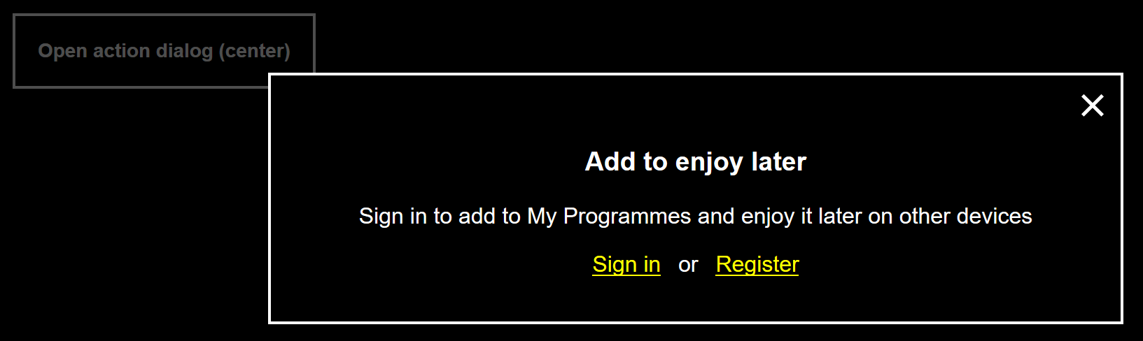
In the following example, we imagine the user has tried to add a programme to 'My Programmes'. Since this functionality is only available to authenticated users, an action dialog asks the user to either sign in or register in order to continue.
  <div class="gel-action-dialog" role="dialog" aria-labelledby="gel-action-dialog__label-1" aria-describedby="gel-action-dialog__desc-1">
    <h3 id="gel-action-dialog-label__1" class="gel-action-dialog__title">Add to enjoy later</h2>
    <div id="gel-action-dialog-desc__1" class="gel-action-dialog__content">
      <p>Sign in to add to My Programmes and enjoy it later on other devices</p>
    </div>
    <div class="gel-action-dialog__buttons">
      <a href="#/path/to/sign-in">Sign in</a>
      or
      <a href="#/path/to/register">Register</a>
    </div>
    <button class="gel-action-dialog__close">
      <span class="vh">close</span>
      <svg class="gel-icon gel-icon--text" focusable="false" aria-hidden="true">
        <use xlink:href="#gel-icon-no"></use>
      </svg>
    </button>
  </div>
</body>
Notes
role="dialog": Thisroleis critical for making the dialog behave in an expected way in assistive technologies such as screen reader software. It also identifies the dialog as a dialog when it is opened and focus is placed inside it.aria-labelledbyandaria-describedby: These relationship attributes associate the text of the dialog's heading/label and content with the dialog element itself. Along with the dialog role, this information is announced upon the dialog being opened. You will need to write or generate unique identifiers for theids required here.class="gel-action-dialog__buttons": A simple, non-semantic wrapper for the action elements. Action elements must be marked up as<button>s if they instigate something on the same page (such as a change of setting or state) or links if they take the user to a new page.class="gel-action-dialog__close": Provide a close button if doing nothing (not authenticating to add a programme after all, in this example) is a viable option. The visually hiddenvh[2] class is provided here to include accessible, translatable text alongside the screen reader inaccessible icon. The close button is deprioritized in favour of the named actions, appearing last in source and focus order.</body>: For the overlay/inert characteristic to function correctly, the dialog must be a child of the<body>element. See Recommended behaviour
Recommended layout
Action dialogs can appear in the center, or at the bottom, of the page. In the reference implementation they appear at the bottom by default. The fixed position value ensures they cannot be scrolled out of view.
.gel-action-dialog {
  position: fixed;
  top: auto;
  left: 0;
  right: 0;
  bottom: 0;
}
The center configuration requires a transform to place the element in the vertical center irrespective of its natural height:
.gel-action-dialog__center {
  top: 50%;
  bottom: auto;
  left: 50%;
  transform: translate(-50%, -50%);
}
With this translation in place, dialogs with considerable content will become obscured at the top and bottom of the viewport. To avoid this, the dialog description element (class="gel-action-dialog__desc") is given a max-height and allowed to scroll vertically:
.gel-action-dialog__desc {
  max-height: 30vh;
  overflow-y: auto;
}
When the dialog is open, sibling elements are given the inert attribute (see expected behaviour, below). The inert content should appear inert by diminishing its visibility. Opacity and/or filtering can achieve this effect.
.gel-action-dialog--open [inert] {
  opacity: 0.3;
}
Note that the style is applied via a class placed on the <body> using the 'gel-action-dialog' namespace. This ensures the specific inert style is only applied in the presence of an open dialog (the style does not 'leak' to other inert instances).
High contrast
How the component looks with a Windows High Contrast Mode theme active: